Imagine cutting your website design time in half with the Astra theme. And you don’t have to do it by navigating several customization options.
You can customize essential sitewide elements like color, typography, headings, buttons, and logo, all in one central place, using the Astra theme Style Guide. This helps you reduce time spent on website customization and design and ensures that all design elements are consistent with your brand identity.
You can picture everything in one place and see how it all fits together to support your brand image and design.
You don’t have to click many options or steps to reach a particular design option in the customizer. Now, with a single click, you can open the settings for color, typography, buttons, and other things.
Since this is a new feature in the Astra theme 4.8 update, let’s quickly explain what the Style Guide is.
What is the Astra Theme Style Guide?
The Astra theme’s Style Guide is a powerful new feature that simplifies customizing your website’s design. With the Style Guide, you can easily control and modify elements like colors, buttons, typography, logos, and site titles from a single, centralized interface.
It is introduced in Astra 4.8 theme updates, along with other notable bug fixes and feature enhancements. You can check the changelog and updates announcement page for more information.
This feature is a major time-saver for web design professionals, allowing you to quickly and efficiently create stunning websites without navigating multiple settings.
The Style Guide streamlines the Astra theme customization process and helps you achieve a consistent and professional look for your online presence.
The good news is that the Style Guide is accessible in both the free and Astra Pro theme versions 4.8.
How Astra Style Guide Can Benefit Users.
If you’re familiar with the traditional WordPress customizer in the Astra theme, you know how it could take many mouse clicks to access elements within it.
Let’s say you want to change the global color and typography settings. Mostly, you decide which element you customize first by going to the specific item on the customizer menu. Then open its settings and make the necessary changes to its design preset.
On a good day, it will take about 4-5 clicks to open both settings, not counting how many clicks it could take to customize the element.
However, with the new Style guide and design options in Astra 4.8, it will take a maximum of 2 clicks to open the customizer for not just color and typography, but also the button, site title, and logo.
One of the biggest advantages of the Astra Style Guide is its ability to maintain design consistency across your website, even when multiple people are working on it. This is especially important for agencies that need to ensure a cohesive brand look and feel.
With the Style Guide, you can make global changes to your site’s design from a central dashboard, ensuring that all elements are updated consistently. This saves time and effort while maintaining a professional appearance.
You see why I said earlier that the new style guide and design features in the Astra 4.8 are really a game-changer for web design agencies and marketing teams.
So, how do you access the Astra theme style guide feature?
How to use Astra Style Guide to Customize Your Site
First, ensure you’re using an Astra version not older than 4.8. If you already have the Asta theme (free or premium) installed, updating the theme automatically introduces the new Style Guide feature.
You can download the latest version of the Astra theme here if you don’t have it.
Once the Astra theme is installed and active on your site, go to Astra>Customize and click the small pencil icon on the Customizer screen.
Like this.

Clicking this pencil icon opens the Style Guide’s new customizer dashboard. Unlike the traditional customizer, this is a dashboard that lays everything out for you.
Instead of making changes to elements individually and previewing them one at a time, this dashboard lets you update multiple design presets and see how changes to one element affect others on the page.
Here is the Style Guide dashboard.
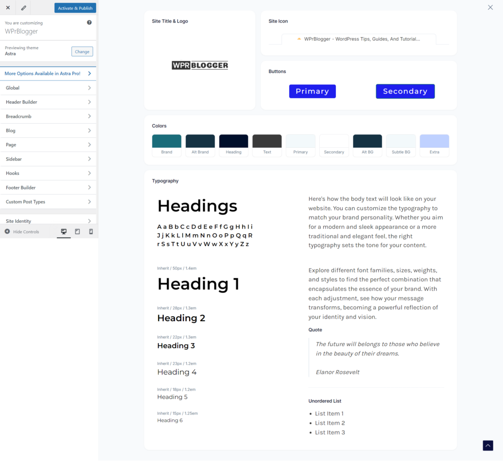
As you can see, you have a holistic view of design elements such as typography, headings, an icon list, a global color palette, primary and secondary buttons, the site title, and the logo in a single design dashboard.
Note that any changes you make here are global or sitewide. This means you should only apply changes you consider to reflect throughout the entire site.
For example, you can choose and customize a global color palette from the Style Guide dashboard. However, if you need to customize the color for a specific page or post, you will need to open that page and make the necessary changes there.
With that out of the way, let us briefly walk through the five major aspects of website templates you can comfortably customize within the Astra style guide dashboard.
Astra Color
Using the Style Guide, select a color from the options to open the global color palette on the left screen. Astra theme lets you customize color for sitewide elements like heading, body text, brand, link, site background, and content background.
You can access these settings directly from the dashboard option and from the control panel on the left side.

If you click the small pencil icon on the Global Palette panel, it opens an additional 10 Astra color presets you can use to quickly design your template and site without manually adjusting colors.
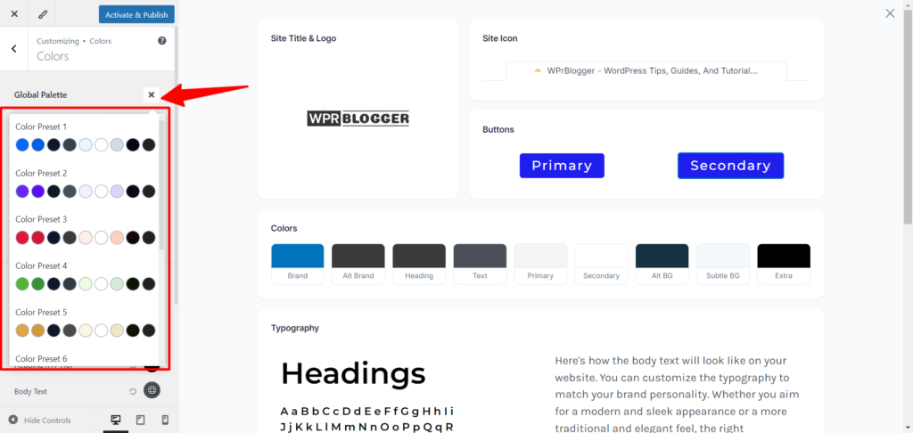
Choose one from the color preset to save time, or if you want to flex your design creativity, you can customize it with the color options on the dashboard.
To change an element’s color using the main dashboard option, hover over the corresponding element box, then click to open the settings on the left side.
Here is an example of the body text I changed from black to blue for the Astra theme.
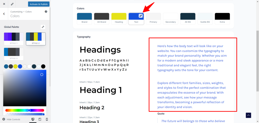
You can refine everything related to sitewide color, such as the site background, links, accents, borders, and content background, in the Global color palette customizer on the left.
This is going to save you time navigating through multiple settings screens and flipping elements from different steps. You can now access and control color from a centralized dashboard instead of switching between the General and Design tabs.
Astra Typography
As with color, you can customize everything related to typography globally from the Astra theme style guide dashboard.
In the previous version of the Astra theme, and as with most WordPress themes, you will need to click one step back to the customizer screen to access another element or template’s part.
For instance, I have finished with the color settings above; now I want to move on to typography. Normally, I need to go back to this page and click Typography to customize it.

However, with the new Astra theme 4.8 style guide feature, I can access all typography settings from the same Style Guide dashboard without clicking a single step backward.
The icing on the cake for this setting is that I can easily customize global or individual H Tag settings (H1 to H6) from here. To do this, hover over the corresponding H tag, then click the pencil icon to reveal its settings on the left.
Just like this…

From here, you can set whether the headings should use title case or sentence case format, set font weight, font family, size, etc. There is so much you can achieve with the Astra theme customizer – the more you play around with it, the better it gets.
Astra Button
Astra theme has always made setting the buttons quick and easy, but this time, it makes it even easier.
Now, you do not have to revert to the menu under the Global settings to customize your site button. You can access it via the style guide page.
Like the rest of the elements, move your computer mouse closer to the button to reveal the edit pencil icon. This action will open the button customizer on the left side of your screen.
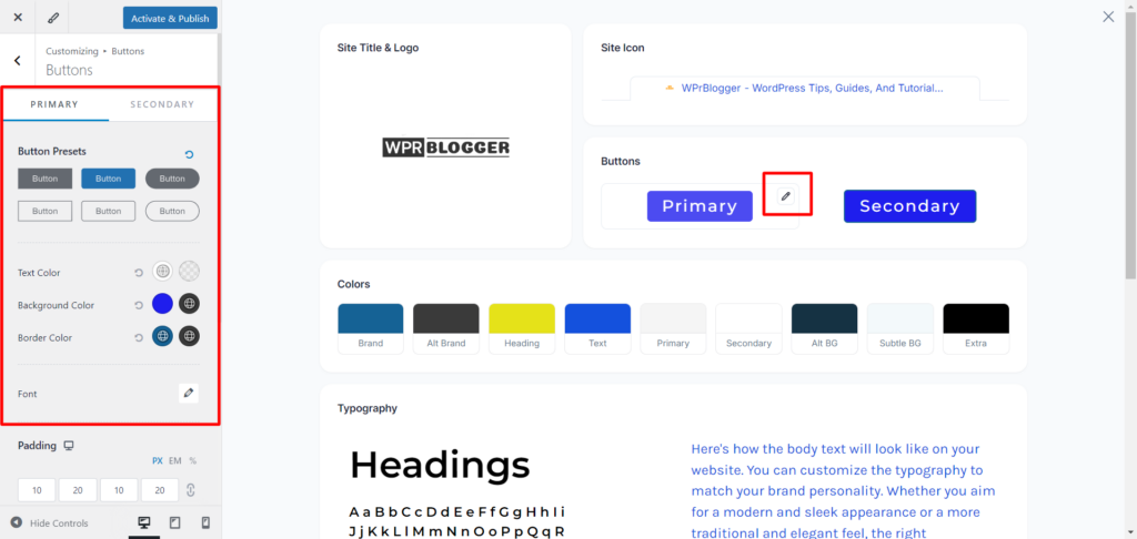
On the customizer, you have two tabs (Primary and Secondary). Each lets you customize the setting for its respective button.
You can define settings for button elements such as padding, borders, fonts, and colors, and even choose from six preset button designs.
Astra Site Title and Logo
The Astar Site and Logo section is where the real benefits of using the Style Guide are most evident, and a time-saving tool. With one click, you can access everything related to the Site header customization.
Clicking the pencil edit icon on the Astra Site Title & logo Style Guide screen magically opens the header templates and gives you access to its settings.

As with all WordPress themes, you can change your site logo here, customize its width, select a different logo for retina display, choose between an inline logo and site titles, and more.
Since this is the main header section, you can add your primary menu, add items to the header navigation, and switch to the Design Tab to customize header elements, including color, tagline, margin, spacing, and more.
Astra Site Icon
Site icon (favicon) is one of the most essential design elements for website branding. Each website is expected to have a unique site favicon.
It helps users identify your site online, in the browser tab, in the address bar, in search engine results, and in bookmarks, etc.
Astra theme has made it easy to add favicons to your site from the Style Guide page. So, as you customize your site typography, buttons, header, and so on, you can also upload a favicon to your site without leaving the page.
To add a favicon to your site from the Astra theme Style Guide dashboard, hover over the site icon text area, click the edit pencil icon, and upload your favorite icon from your computer or the WordPress media library.
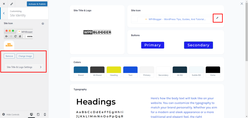
You can click the Site Title & Logo Settings link to open additional settings for the site icon, header, and logo area. It’s up to you what you want to do here and how much you want to customize your site.
Conclusion
Astra theme Style Guide is really a game-changer in web design and an amazing productivity feature. Without spending too much time, you can build a coherent website brand design from a single place.
The good part is that the preview option is just right on the page; there is no need to switch back and forth to check design changes on the website’s front end.
Everything is applied and previewed within the Style Guide window.
However, not every Astra theme customization feature is available in the Style Guide dashboard; only the essential elements required for most website designs are available.
What do you think about the new Astra theme Style Guide feature? Do you think it helps save time and make you more efficient while designing your site?

Notice:
Your comment will end up in the trash folder if you spam our comment box. Use your real name, write meaningful and genuine comments. Avoid using keywords or brand name in the name filed and keep your comment relevant to the topic. Thank you.